Member Portal Redesign
For a research membership business, navigation is how members perceive the value of the product. If members can't quickly reach the right reports, benchmarks, or peer insights, the content can be strong and still feel inaccessible.
I'm redesigning the portal's IA, navigation, and overall design end to end, restructuring four levels of content hierarchy, aligning the UI to a validated content model, and shipping an MVP while a parallel rebrand adds real constraint.
Problem
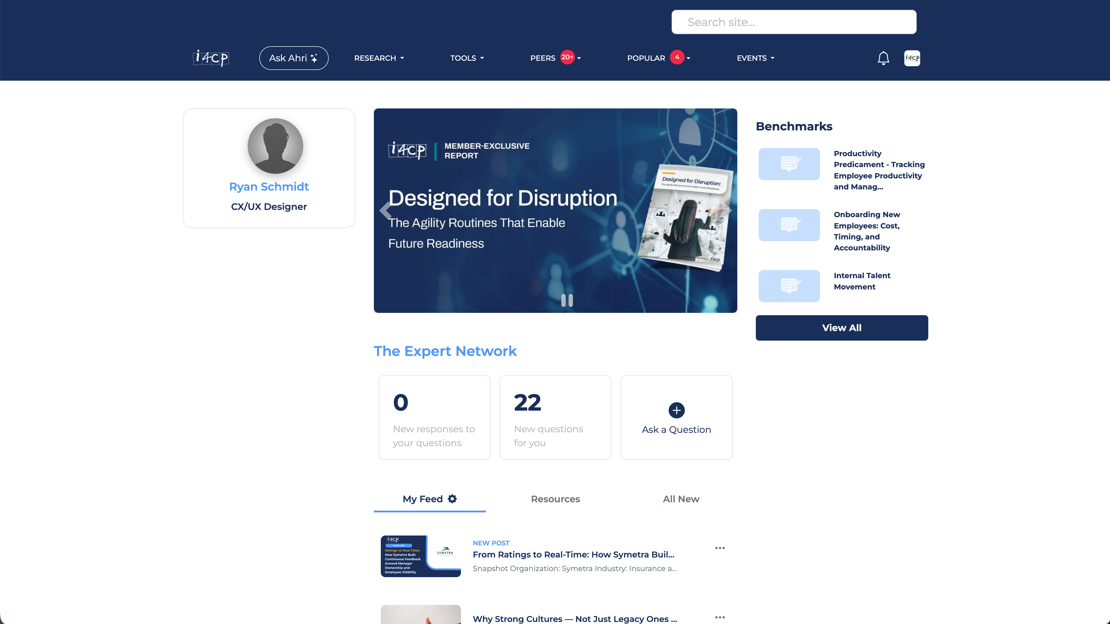
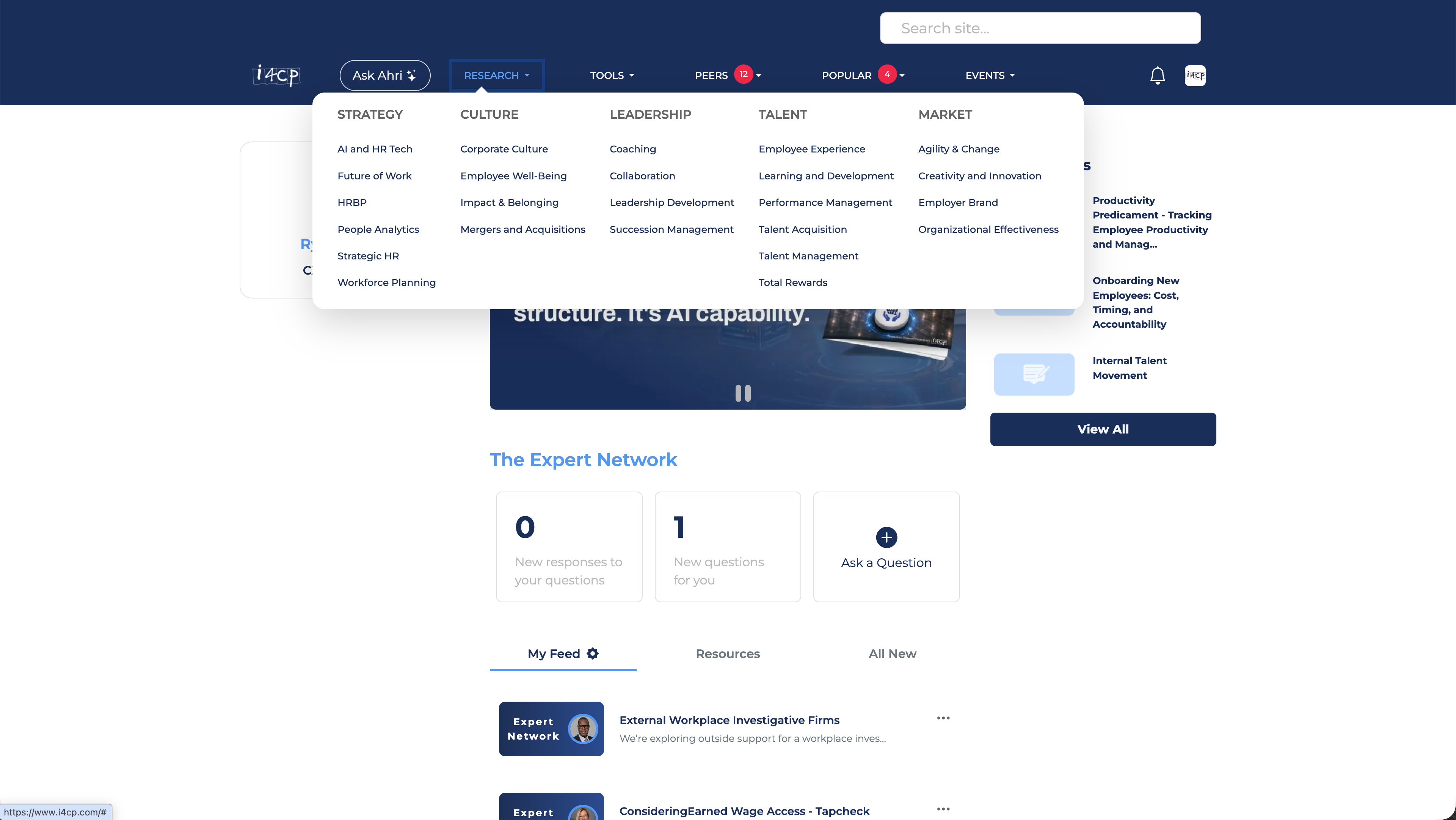
Members couldn't find what they came for. i4cp's value is in its research: reports, benchmarks, and peer insights organized around HR practice areas like leadership, talent, and culture.
The content model wasn't the problem. Years of member interviews and internal research had already produced a well-validated topic taxonomy before I joined. The gap was between that taxonomy and what the UI actually showed people.
Goals
- Close the gap between content model and navigation: Make the portal's structure legible to members from the moment they land
- Reduce friction in research discovery: Help members get from intent to the right report, benchmark, or insight faster
- Ship a meaningful MVP: Deliver a better experience without waiting for every surface to be perfect
Research
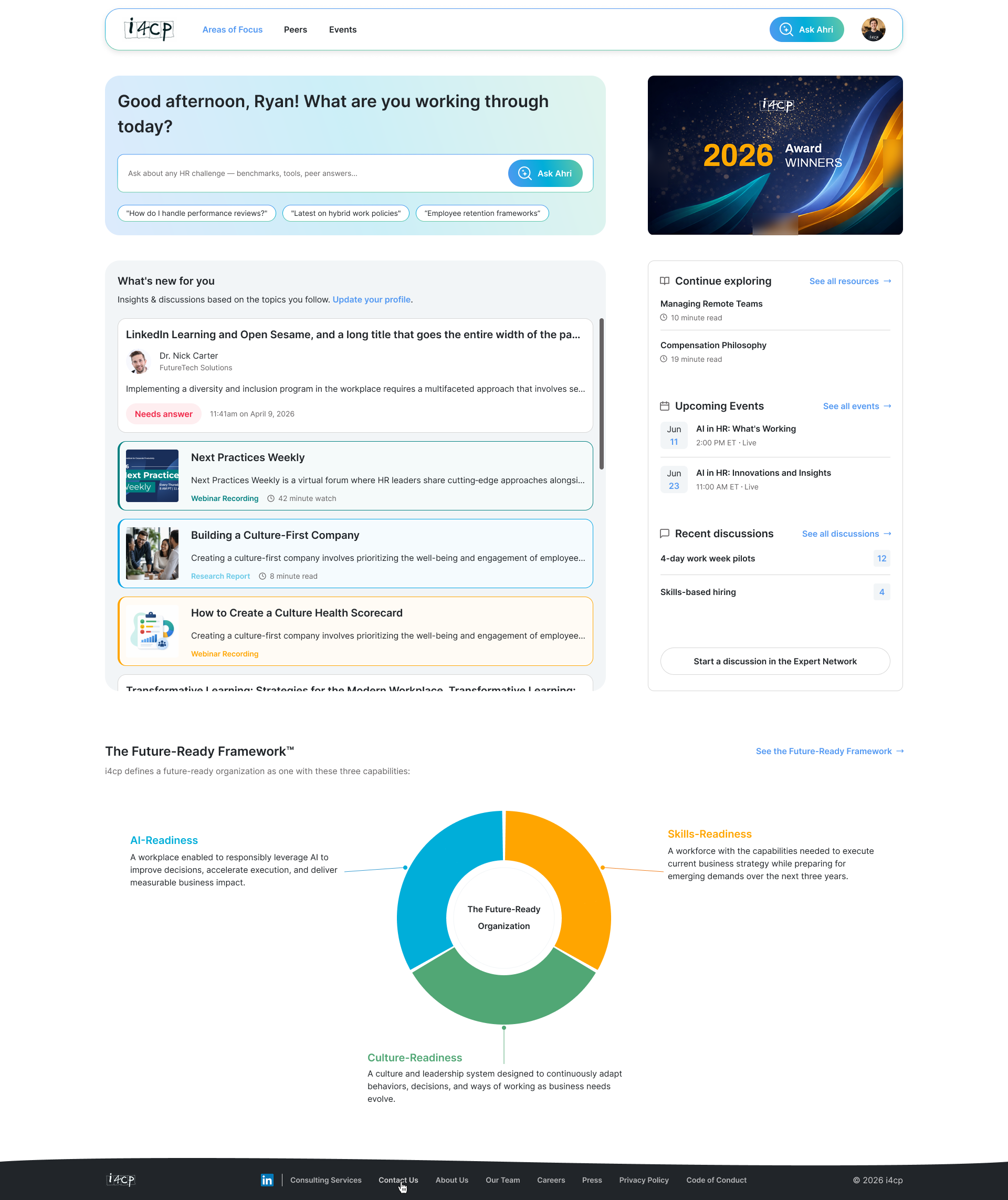
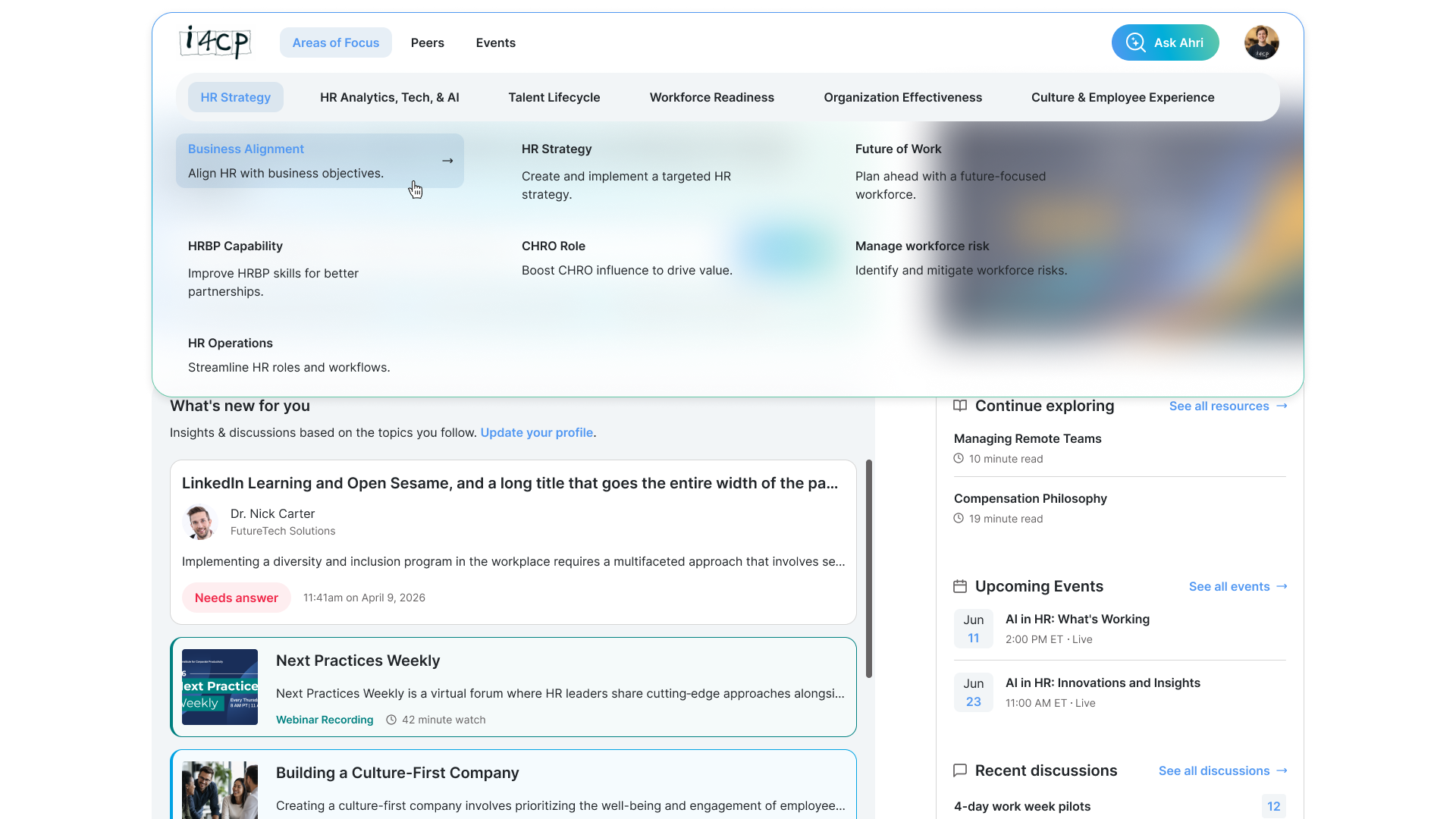
The taxonomy itself was not something I needed to reinvent. Our researchers had identified a new taxonomy that was already in progress when I joined. The design problem was translation: how to make that validated 4-level structure visible and usable inside the product. I designed a navigation model that exposed the right level of depth at the right moment.
Moderated validation testing with active members is planned for July, focused on task success across the four IA levels.
The IA challenge: four levels without losing the thread
Content hierarchy
The model moves from broad member intent to specific resources across four levels.
The broadest practice domains (e.g. leadership, talent, culture)
The strategic questions within each area
Specific subject clusters within each priority
Articles, videos, webinars, benchmarks
For example, a member looking for leadership succession benchmarking might start with Leadership as a broad area, narrow into a strategic priority, scan related topics, and then choose between reports, benchmarks, webinars, or peer discussion content. The navigation needed to support that narrowing path without exposing the entire taxonomy at once.
Defining decision
Progressive disclosure over flat navigation.
Exposes too much structure at once, creating a noisy entry point for members who need a clear next step.
Reveals deeper levels only as members commit to a practice area or priority.
I structured the navigation so Areas of Focus orient members at the top level, with Priorities and Topics revealed as they narrow intent. The goal was to make four levels feel like a natural path, not a taxonomy buried in dropdowns.
Constraints
- Parallel rebrand: A third-party consultant was evolving i4cp's visual identity at the same time. Ideally, we'd have built new tokenized variables in Figma and CSS from scratch. Due to timeline constraints, we had to map to the existing token structure instead.
- MVP scope: A full IA overhaul touches nearly every surface of the portal. I phased the work deliberately. The MVP ships the restructured navigation and a completely refreshed look and feel, with small to moderate UX improvements. Deeper UX improvements to follow post-MVP, with designs and tickets already ready to go. The goal was to ship something meaningfully better and more useful without waiting for every surface to be perfect.
Current status
- Designs complete: All shippable designs are complete and in the dev's hands.
- Validation: moderated member testing planned for July.
- Outcomes: not available yet; this case study will be updated after validation and launch data are available.
Planned validation criteria
In July validation, I plan to evaluate whether members can:
- Identify the right Area of Focus from a realistic research task.
- Move from Area of Focus to Priority or Topic without confusion.
- Understand what type of content they are selecting before clicking.
- Complete key discovery tasks without relying on search.
- Explain where they are in the content hierarchy after navigating.
This case study will update with real results after July. For now, these five criteria are the bar I'm designing against.