AI-Powered Custom Dashboards
Users were ignoring our default dashboards because the experience did not match how they monitored their work. I redesigned the product around customizable, role-based dashboards with AI-supported summaries, increasing engagement by 71%.
At a glance
- Business Problem: Users ignored static default dashboards while leadership wanted an AI-first UX. Research revealed users needed trustworthy KPI anchors before adopting AI insights.
- My Key Decisions: Designed customizable, role-based dashboards as the core anchor, layering AI summaries on top of verified metrics rather than replacing dashboards.
- Impact & Outcomes: Drove +71% beta engagement, 62% multi-dashboard adoption, and transformed static reporting into an interactive sales-demo highlight.
Problem
Across early user research, stakeholder conversations, and prototype testing, the pattern was consistent: users needed configurable dashboards anchored in familiar metrics before they trusted AI-generated summaries.
Objectives
The goal wasn't just to add metric cards to the existing dashboards or to introduce another dashboard. Rather, we made them customizable, permissions-based, and highly editable. Users could create and save multiple dashboards, each tailored to their specific business needs. We also added AI-powered summarized reporting capabilities, which became a highlight in sales demos.
- Personalized dashboard creation
- AI-generated executive reports
Research Insights
Research
- Interviews: 10 users (6 power users, 4 stakeholders)
- Core insight: Users either ignored dashboards entirely or rarely used them
- Constraint: Sales needed immediate “wow” dashboards for demos, so we wanted all three features in the same release
Design implications
- Prioritize role-based templates over a single generic layout
- Make customization and AI report generation fast and obvious to reduce friction
- Design one or two “demo‑ready” views that give sales instant visual impact
Design Approach & Decisions
-
Scope the feature
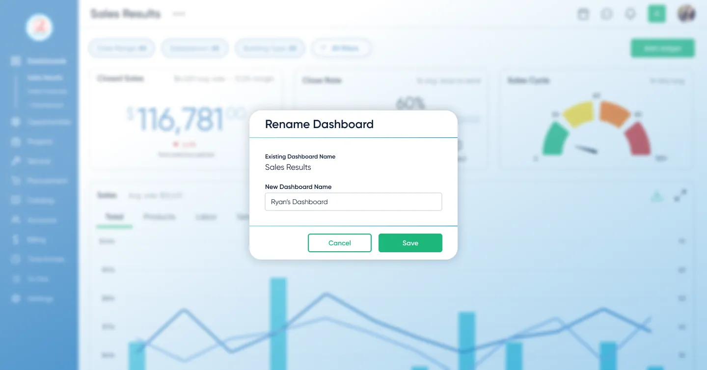
I focused the release around role-based templates that helped users start quickly without locking them into rigid layouts. Users could start from a template, build from a blank dashboard, add widgets, rearrange sections, and choose visualization styles.
The goal was to make dashboards flexible enough to replace spreadsheet exports without forcing every team into the same view.
-
Build trust with data
Limited AI to verifiable metrics after research showed users trusted dashboards more than opaque outputs. The AI was not allowed to invent conclusions; it could only summarize the visible data on the dashboard so users could trace the AI's logic back to a specific chart.
Defining Decision: Dashboards Before AI
Leadership believed users might eventually bypass traditional dashboards and ask AI direct business questions instead. It was a reasonable hypothesis, but research pointed to a different behavior: users struggled to ask useful questions before they had seen their own data.
My argument was that business owners needed familiar KPIs as anchors. Without visible metrics, trends, and exceptions in front of them, they had no reliable starting point for exploration.
Interviews supported that direction, so I pushed the team toward a hybrid model: dashboards would establish awareness and trust, while AI would explain and summarize the data users could already verify.
- Dashboards: visibility, orientation, and trust
- AI: summarization, reporting, and explanation
Prototyping & Validation
I prototyped the end-to-end flow in Figma and tested it with 5 target users — from choosing a template to customizing widgets and generating an AI summary.
Iteration: more KPI cards, more control
Early concepts kept dashboards minimal. Research showed teams wanted a large set of KPI cards for the metrics they already knew we tracked—and they wanted to rearrange and edit them to match how they run their day. I expanded the design to support dense KPI cards with fast drag‑and‑drop editing and rearranging. That increased scope and timeline, but it removed the core adoption blocker: visibility and control.
- 4/5 users said templates matched how they think about their work
- All users created and customized dashboards without intervening or guidance
These sessions validated the core flow and allowed us to defer advanced metrics and broader AI safely.
Impact
Dashboards shifted from being ignored to becoming the primary way teams monitored their work.
They also improved demo effectiveness, giving sales teams immediate, high-impact views tailored to different audiences.
Users reached an average interaction depth of 2 customizations per chart, showing they weren’t just viewing dashboards. They were actively tailoring charts to fit specific operational questions and workflows.
Lesson
The project reinforced that research is what makes pushback credible. The AI-first hypothesis was reasonable, but interviews showed users needed familiar KPIs before they could ask useful questions. That evidence shifted the team toward a hybrid model: dashboards for trust, AI for explanation.
Next Steps
The team planned to expand AI summarization to other parts of the platform, building on the trust the dashboard work had established. I left D-Tools before that shipped, but the pattern of dashboards first, AI layered on top became the template for how they approached AI features going forward.