Building a Design System for an Enterprise B2B Platform
I built and maintain a token-first design system for an 8-year-old B2B platform, unifying a fragmented UI into a cohesive product.
Problem
The platform felt like four different products stitched together. Nearly a decade of incremental features had created conflicting color systems, typography scales, and interaction patterns across more than 120 modules.
Teams were rebuilding similar UI from scratch, shipping one-off patterns, and spending extra time on QA. Customers felt the seams between modules and described the UI as dated and toy-like.
Goals
- Unify the experience: Make four modules feel like one product with consistent navigation, typography, and color
- Enable faster delivery: Give teams a reliable component library that increases reuse and reduces design QA
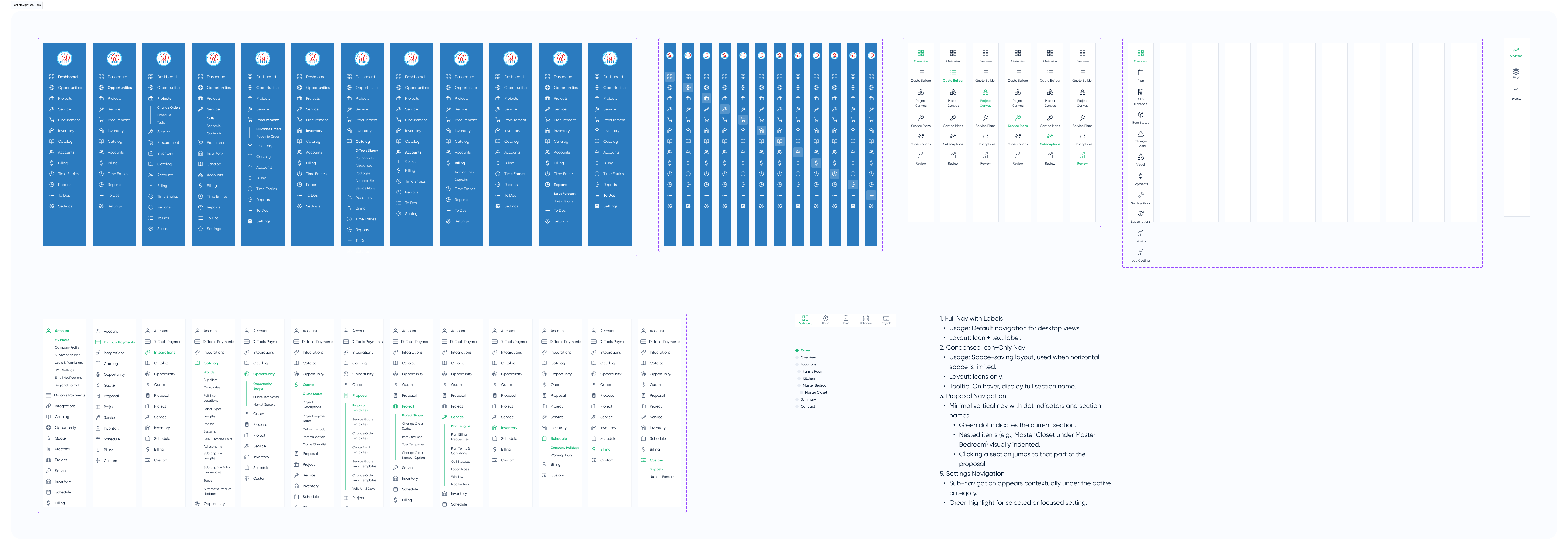
- Improve accessibility: Ground palette and type in APCA/OKLCH for readable, professional data screens. Define governance for how components get added and versioned
Research & audit
- UI audit: Captured 200+ screens and cataloged 80+ unique button, form, and navigation styles to see where patterns diverged
- Stakeholder interviews: Teams described the UI as "toy-like" and "inconsistent between modules," citing duplicated work
- Accessibility review: APCA checks flagged low-contrast combinations on critical tables and navigation
Takeaway: A reskin alone wouldn't work. We needed a token-driven system balancing brand, accessibility, and engineering feasibility.
Building the system
Start from foundations, not components
Instead of jumping straight into buttons and cards, I defined foundations that could scale across all modules.
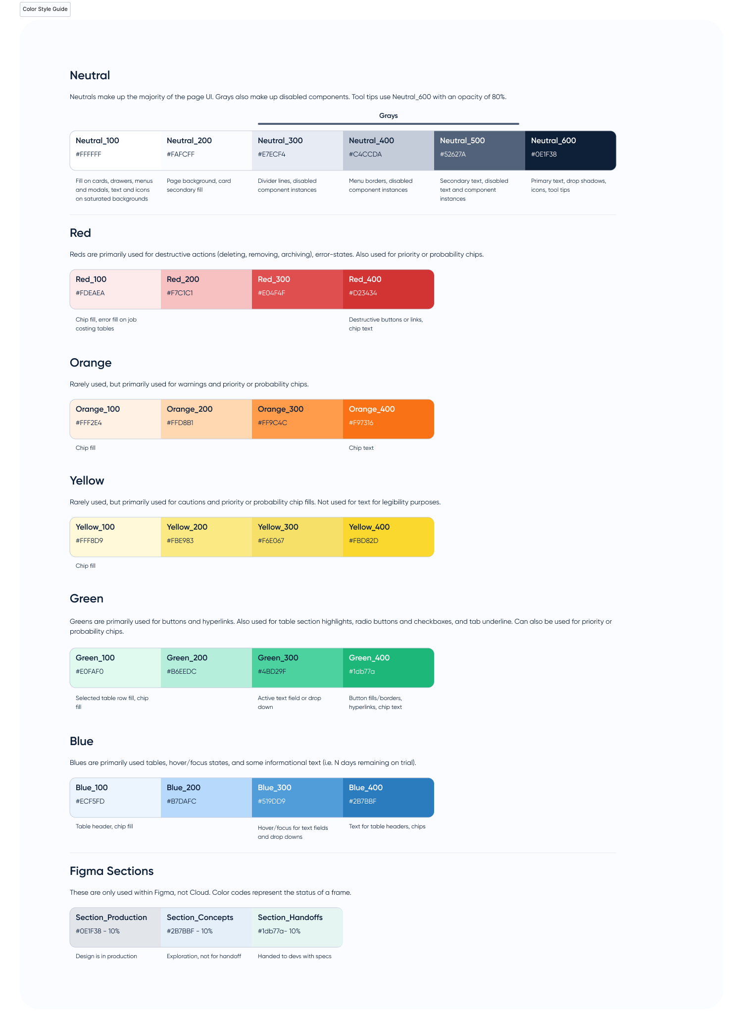
- Established a neutral, professional base palette in OKLCH, then added semantic roles like
surface/subtle,border/strong, andalert/critical. - Rationalized type into a clear hierarchy for headings, body, and meta text tuned for dense, data-heavy screens.
- Created a spacing system aligned with existing engineering breakpoints to minimize layout churn.
Design a token architecture engineers can use
From foundations, I created a token architecture that separates raw values from semantic usage so themes can change without rewriting components.
- Introduced design tokens for color, typography, spacing, and radius in Figma, mirroring a structure that can be mapped directly to variables in code.
- Documented naming conventions and usage examples (for example, when to use
border/strongvsborder/subtle).
Build, document, and govern
With tokens stable, I rebuilt high-traffic components matching real product states, standardized interactive states across all patterns, and documented configuration options to reduce one-offs.
To keep the system healthy, I set up a lightweight intake process for new components and partnered with engineering on a code-backed library so reuse lives beyond Figma.
System architecture
Tokens
Color, type, spacing, and radius tokens for neutral, brand, and semantic roles — the raw ingredients everything else pulls from.
FoundationsSemantic roles
Tokens mapped to intent: surface/primary, border/strong, text/muted, alert/critical, and so on.
MappingComponents
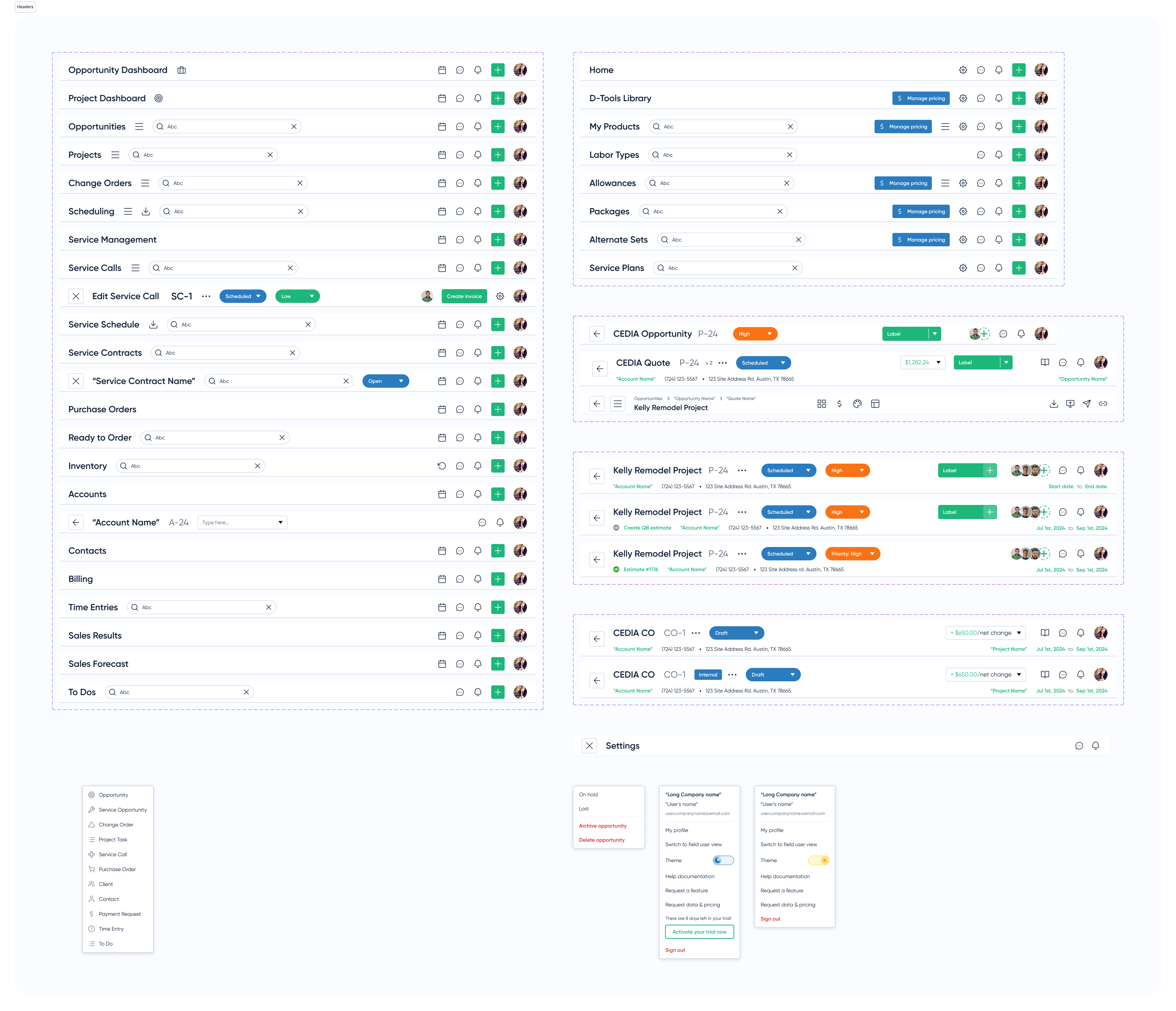
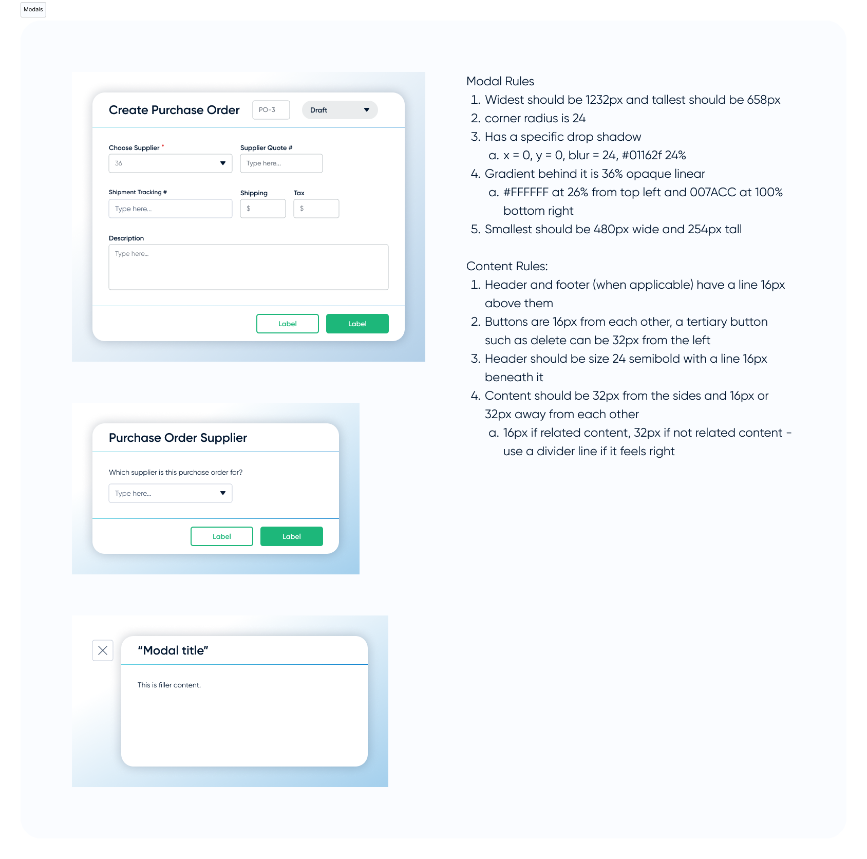
Reusable patterns built from roles: buttons, forms, navigation, tables, modals.
Building blocksProduct surfaces
Full screens and workflows — dashboards, record views, reporting flows — composed from those components.
ScreensThe funnel connects a single source of truth for tokens to complete product workflows.
Design highlights
A few snapshots of how the system shows up in real product surfaces, from token definitions to navigation, headers, and component rules.
Interactive Component API
Modify tokens to generate live CSS and verify contrast ratios.
Adoption & rollout
Rolling this out was as much about behavior change as it was about UI. I broke adoption into clear phases so teams always knew what to do next.
Phase 1: Designer pilot — Rolled system out to designers first. Within six months, 85% of new UI used library components
Phase 2: Education & migration — Created migration guides and ran working sessions to refactor legacy screens, prioritizing high-visibility flows
Phase 3: Code integration — Partnered with engineering to implement tokens in code. New features now use system components by default
Business impact
Customer-facing teams now describe the platform as one product instead of four tools stitched together, and demos no longer require custom theming to feel credible.
Component reuse reached 85% for new designs, and requests to white-label the product dropped by roughly 50% as the default UI felt more professional and on-brand.
The design system frees both design and engineering from pixel-pushing, so more energy goes into shipping value-add features rather than recreating UI from scratch.
Lessons & next
Lessons
- Single-owner systems don’t scale forever. Being the sole owner worked for v1 but became a bottleneck. I am now defining shared ownership with an engineering counterpart and documenting decision criteria so others can safely contribute.
- Migration is where systems live or die. Designers adopted the new components quickly, but we underestimated the effort to migrate legacy screens. A more explicit module-by-module migration plan earlier would have reduced friction.
- Governance has to be visible. Early on, people weren’t sure how to propose new patterns. A lightweight intake process and “experimental” labels made it safer to evolve the system incrementally.
Next
- Deepen engineering integration. Continue evolving the code-backed library so all new features use system components by default and reduce custom one-offs in production.
- Ship dark mode end-to-end. The dark-mode token set is designed; next step is coordinating an end-to-end rollout across modules, then exploring whether customer theming makes sense.