AI-Powered Custom Dashboards
Teams ignored the default dashboard, relying on ad-hoc report requests and spreadsheet exports instead.
I redesigned it into customizable, role-based dashboards with AI-supported summaries—shifting teams toward self-serve reporting, cutting export reliance in half, and increasing engagement by 71% during beta.
Phase 1 · Understand
Problem
Teams flooded us with ad‑hoc report requests or exported everything to spreadsheets. This slowed decision‑making, increased reporting overhead, and made the product look less "enterprise‑ready" in demos.
Objectives
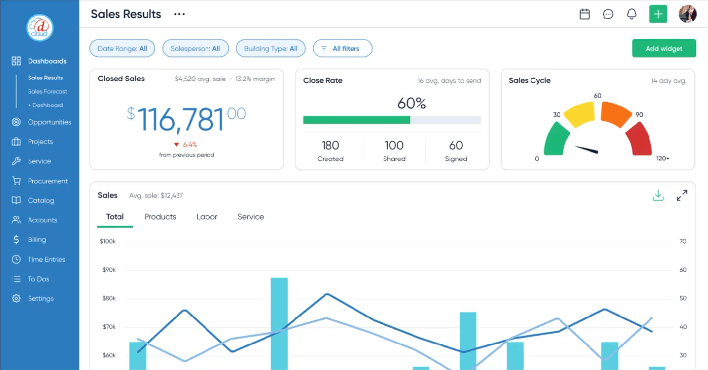
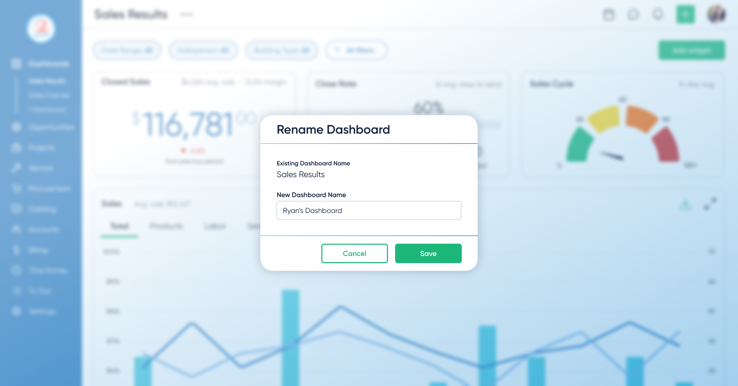
- Personalized dashboard creation
- AI-generated executive reports
Research Insights
Research
- Interviews: 10 users (6 power users, 4 stakeholders)
- Core insight: Users skipped dashboards and went straight to exports—they wanted familiar KPIs surfaced as quick-scan, role-based views
- Constraint: Sales needed immediate “wow” dashboards for demos
Design implications
- Implication 1: Prioritize role-based templates over a single generic layout
- Implication 2: Make customization fast and obvious so users stop exporting to spreadsheets
- Implication 3: Design one or two “demo‑ready” views that give sales instant visual impact
Phase 2 · Decide
Design Approach & Decisions
- Scope to core roles: Focused MVP on role-based templates instead of edge cases—pushed back on “everything in v1” to ship faster and cleaner
- Constrain AI to build trust: Limited AI to verifiable dashboard metrics after testing showed low trust in black-box outputs
Defining Decision: Dashboards vs. AI-first
Stakeholders initially pushed for an AI-first approach—assuming users would prefer prompting for insights instead of navigating dashboards.
Based on user interviews, I pushed back. Most users didn’t know what to ask for upfront—they relied on familiar KPIs to orient themselves before exploring deeper insights.
I aligned the team around a hybrid approach:
- dashboards as the foundation for visibility and trust
- AI layered on top for summarization and reporting
This ensured users could see and verify their data first, while still benefiting from AI-generated insights.
Design Highlights

Phase 3 · Evidence
Prototyping & Validation
I prototyped the end-to-end flow in Figma and tested it with 6 target users — from choosing a template to customizing widgets and generating an AI summary.
Iteration: more KPI cards, more control
Early concepts kept dashboards minimal. Research showed teams wanted a large set of KPI cards for the metrics they already knew we tracked—and they wanted to rearrange and edit them to match how they run their day. I expanded the design to support dense KPI cards with fast drag‑and‑drop editing and rearranging. That increased scope and timeline, but it removed the core adoption blocker: visibility and control.
- 6/6 users said templates matched how they think about their work
- All users created and customized dashboards without guidance
These sessions validated the core flow and allowed us to defer advanced metrics and broader AI safely.
Impact
Dashboards shifted from being ignored to becoming the primary way teams monitored their work.
They also improved demo effectiveness, giving sales teams immediate, high-impact views tailored to different audiences.
Phase 4 · Forward Thinking
Next Steps
- Depth for power users: Add advanced metrics and drill‑downs requested by power users before GA, while keeping default dashboards simple and focused.
- AI expansion: Gradually expand AI to suggest cross‑dashboard insights once we can validate accuracy and trust with real usage data.