
i4cp Member Portal & Research Discovery
Members were struggling to find research in a portal organized around internal categories. As i4cp's sole product designer, I turned a research-team taxonomy into navigation and discovery flows members could use, and brought Ahri into the main discovery experience.
At a glance
- The Problem: Members were struggling to find research in a portal organized around internal categories, putting engagement at risk.
- What I Built: Restructured the four-tier taxonomy around executive priorities, introduced progressive disclosure to keep navigation calm, and brought Ahri into the primary discovery experience.
- The Result: The redesigned portal launched on September 11, 2026. Following launch, Ahri sessions increased 500% and daily activity doubled, backed by strong qualitative member feedback.
Problem
i4cp publishes extensive workforce research and benchmarks, but members were struggling to find relevant studies. The portal's navigation had grown organically over years, ending up organized like an internal org chart rather than a member resource. If a VP of Talent wanted a compensation benchmark, they had to click through three arbitrary categories and hope for the best.
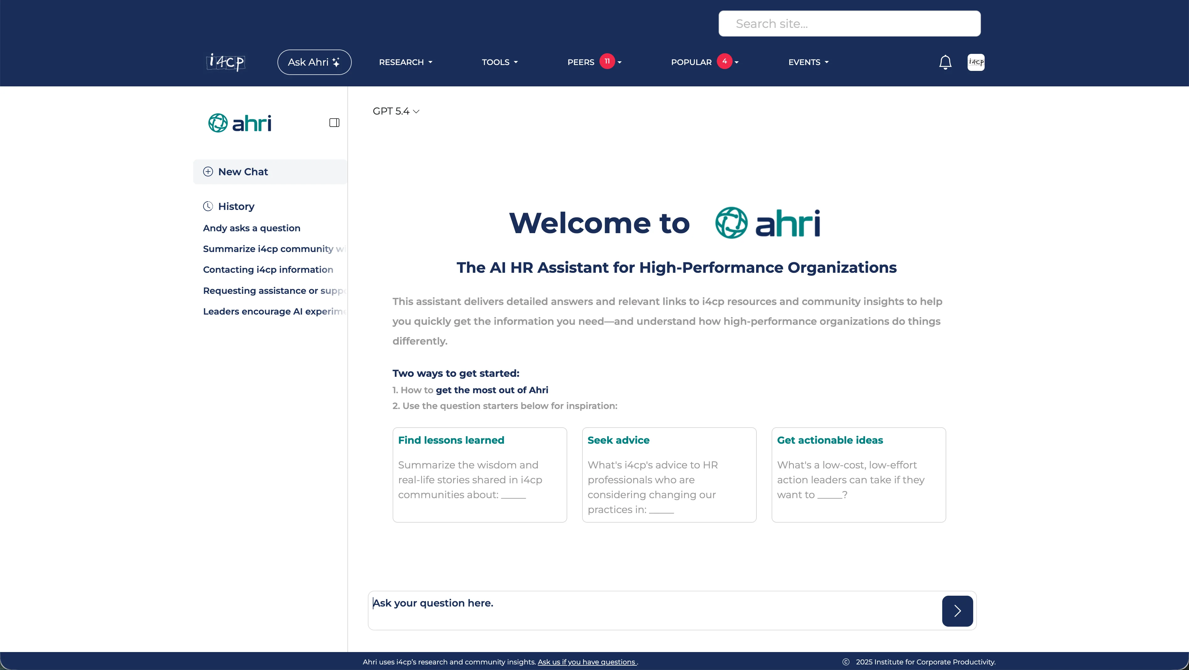
Usage logs showed the disconnect. Members would log in, navigate through cluttered categories, type keywords into legacy search, and get a wall of scattered links. While Ahri existed as a dedicated AI research tool, it was disconnected from the primary discovery flow. My job was to rebuild the navigation model around member intent, bringing Ahri and conversational synthesis directly into the front door of research discovery.
Goals
- Organize by member intent: Map categories to how HR executives describe their business priorities rather than internal research groups.
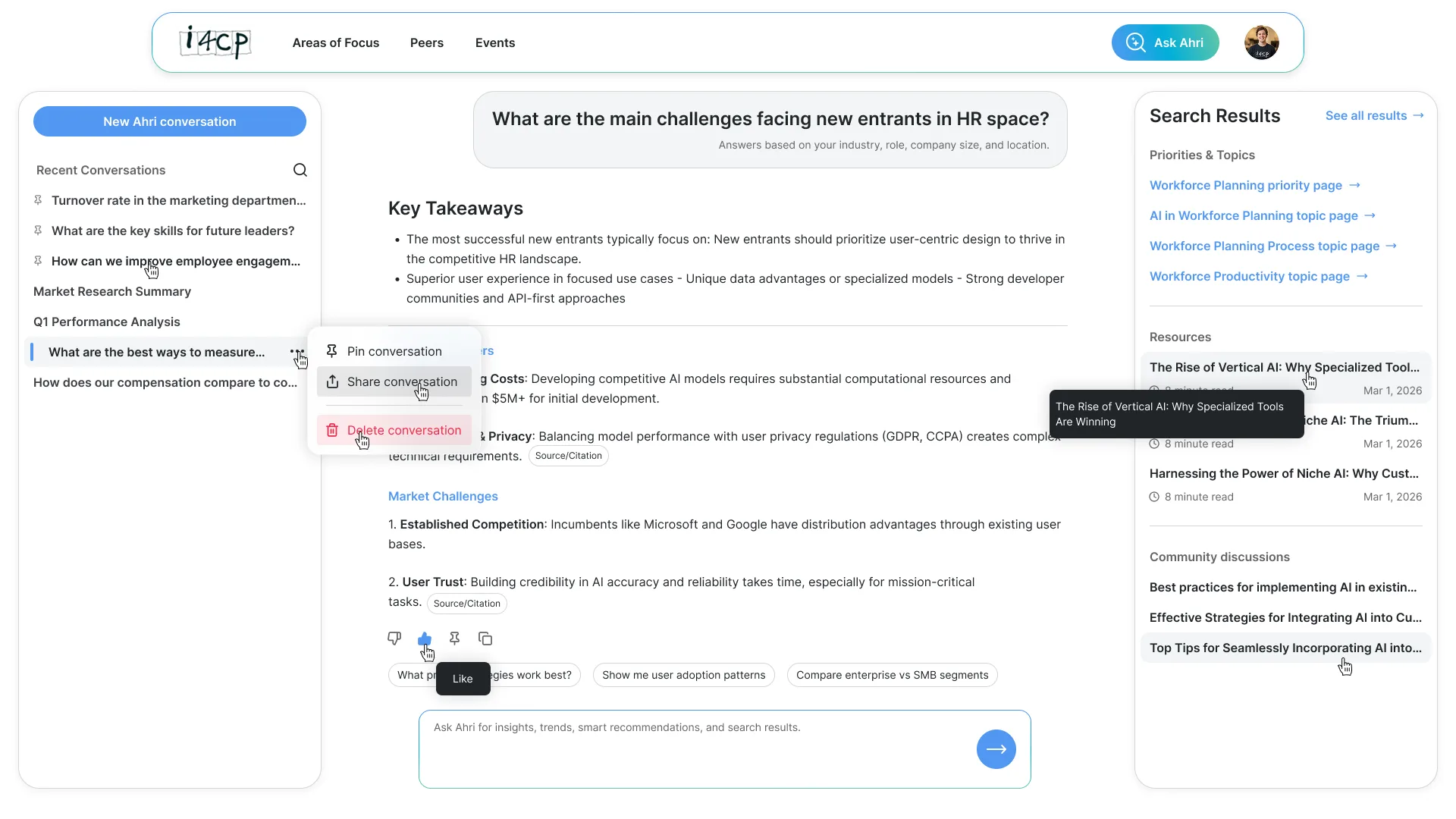
- Bring AI into discovery: Make Ahri the central entry point for research discovery, with a direct way to see traditional results when needed.
- Ship a clean MVP first: Redesign the primary navigation, homepage, and search entry points without trying to rebuild the entire portal in one giant sprint.
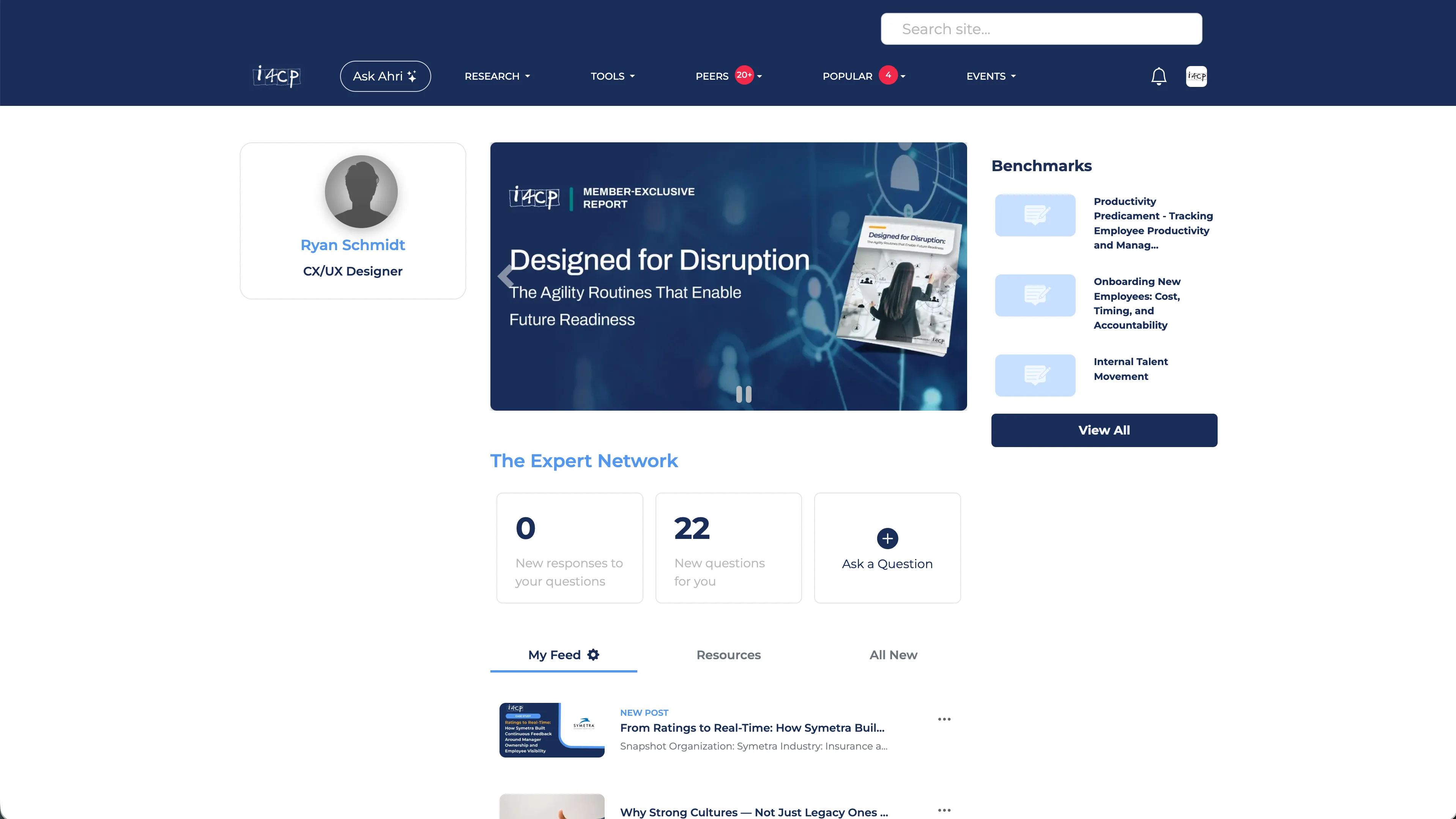
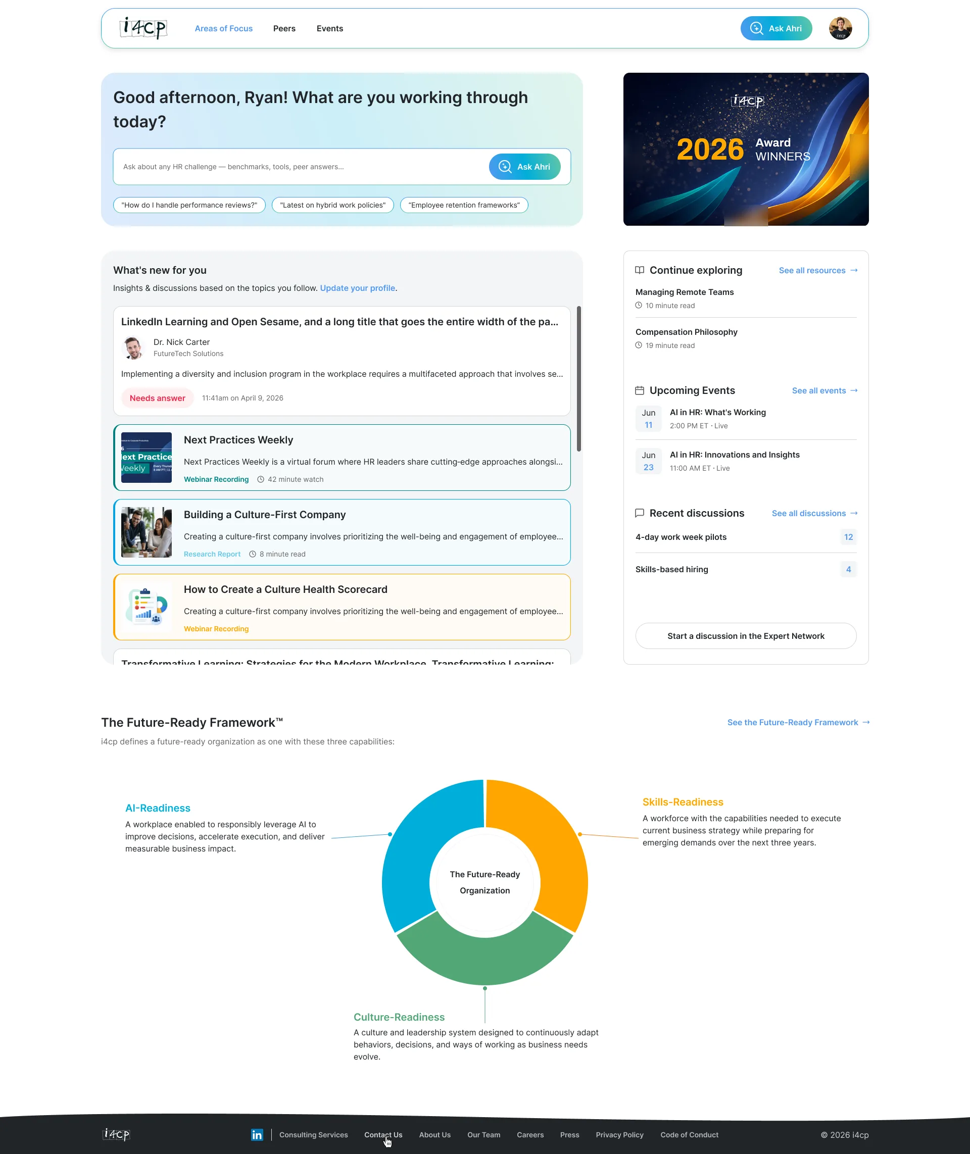
Research
The four-tier taxonomy framework had already been established by i4cp's research leadership before I joined the project. My challenge was translating that conceptual taxonomy into an intuitive digital experience without overwhelming members.
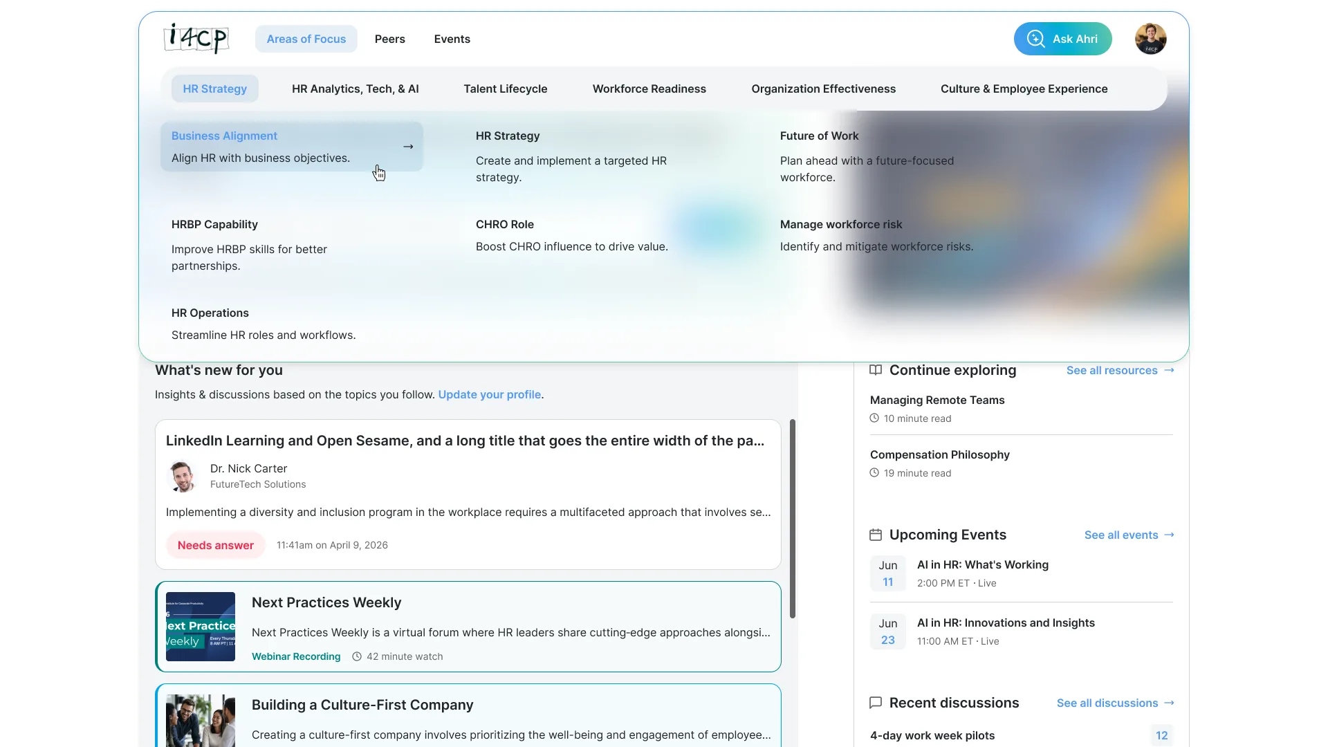
To evaluate navigation models, I conducted moderated usability testing sessions with 5 enterprise HR executives. Testing quickly revealed the design boundaries: dumping all four tiers into a dense megamenu paralyzed members with dozens of competing links, while burying topics inside nested drill-downs meant related research studies were rarely discovered. Those sessions confirmed that progressive disclosure was the right model, exposing deeper topics only after a member selected a primary practice area.
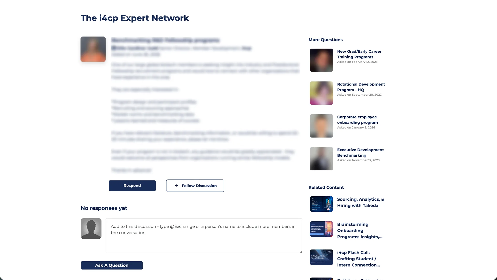

The IA Challenge: Four Levels Without Losing the Thread
The content hierarchy spans four tiers: Areas of Focus, Priorities, Topics, and individual assets. The legacy portal mirrored our internal filing system. The redesign organizes research around the strategic questions members ask their teams.
Content hierarchy: Four Levels Without Losing the Thread
The model moves from broad member intent to specific resources across four tiers. Click each level to see how progressive disclosure keeps navigation calm.
For example, an HR leader looking for leadership succession benchmarking starts with Leadership as a broad domain, narrows into a strategic priority, scans related topics, and picks their preferred format (a research report, quick benchmark, or webinar). The navigation guides that narrowing journey without dumping the whole taxonomy on them at once.
Defining decision
Progressive disclosure over flat navigation.
Exposes too much structure at once, creating a noisy entry point for members who need a clear next step.
Reveals deeper levels only as members commit to a practice area or priority.
I explored flatter navigation patterns, including an expandable tree menu, but user testing showed it felt like browsing a dense Windows file system. Progressive disclosure won because it gives members a calm, clear starting point, revealing sub-topics only as they click deeper into an area of interest.
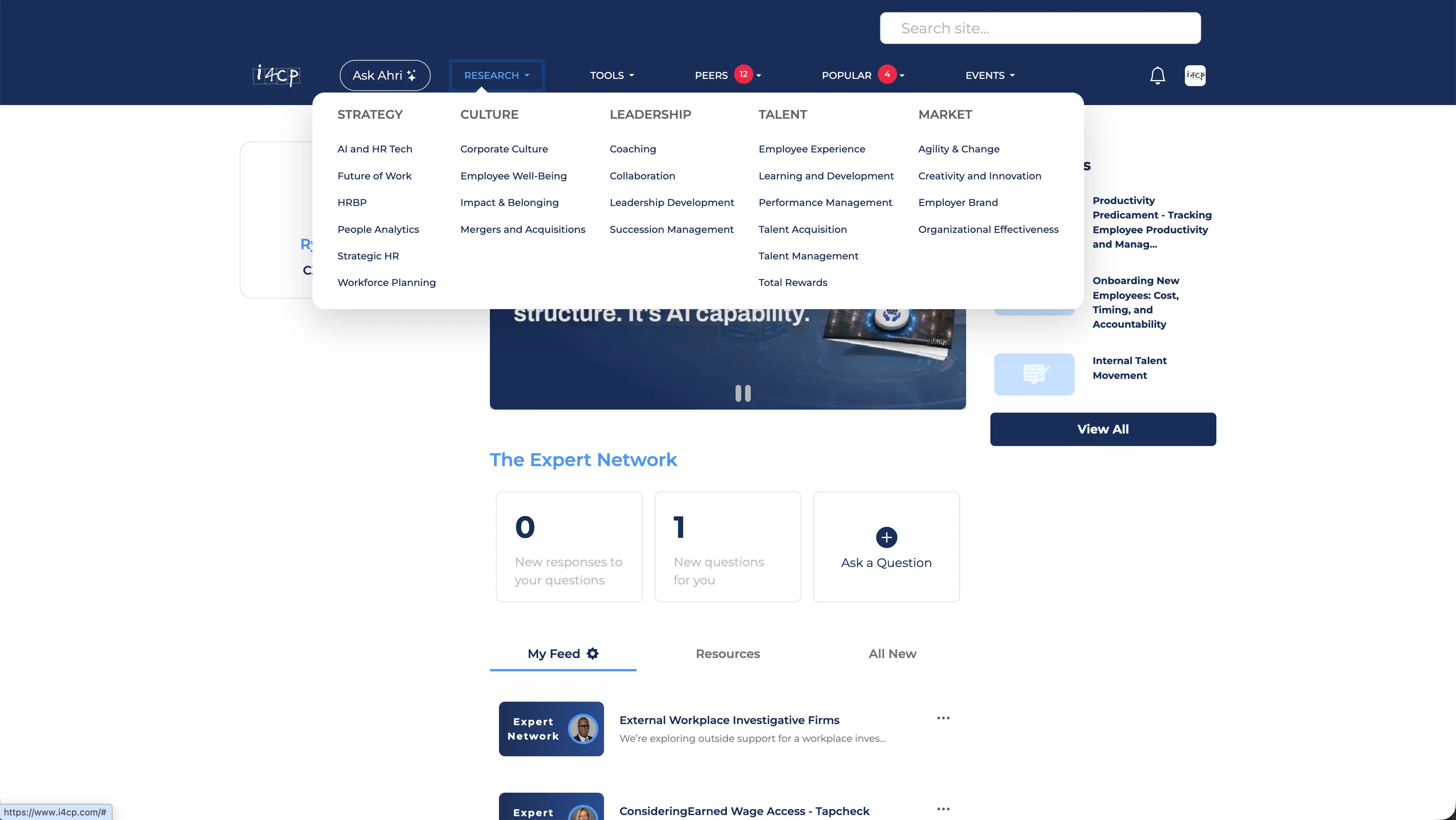
Discovery & Search Entry Points
Every search starts in Ahri's AI experience. Members can then choose See all results to open a traditional search results page. That keeps one clear starting point while preserving a way to browse the full results.
Constraints
Designing During a Rebrand
An external agency was overhauling i4cp's brand guidelines at the same time, meaning colors, fonts, and styling rules were in constant flux.
Design Token Layer
I built the portal UI on a foundation of CSS variables and design tokens. When the agency handed over finalized colors and type specs, we updated them in one place without touching component markup.
Enormous Surface Area
Changing the information architecture affected nearly every page on the platform. Trying to redesign everything at once would have delayed release by a year.
Strict MVP Phasing
We focused Phase 1 strictly on the primary navigation, global search, and the homepage. Deeper administrative views and secondary subpages were scheduled for fast follow-ups.
Post-MVP Roadmap
We intentionally postponed deeper workflow features (like automated research synthesis briefs, peer benchmarking matching, and customized alert digests) so we could ship the new navigation and discovery engine without slipping our deadline.
Outcomes & Impact
The redesigned portal launched on September 11, 2026, delivering immediate gains across member engagement and executive research discovery.
Qualitative feedback from HR executives confirmed that bringing conversational synthesis into the main search flow solved their biggest friction point: getting verified research takeaways without digging through internal taxonomies. Daily active portal usage doubled, and Ahri sessions increased 500% in the weeks following release.
Attribution context: Because Ahri became the primary search surface, total session volume naturally surged with overall traffic routing. However, post-launch member telemetry and qualitative interviews validated deeper genuine engagement: session duration increased, follow-up query rates rose, and members consistently reported saving 10 to 15 minutes per research inquiry compared to manual PDF downloads.
Taking the work through release
My role extended beyond the design files. I wrote Trello tickets and tested the implementation in staging, helping turn design decisions into work the team could build and check before release.
By designing clear pathways through our four-tier taxonomy and backing it up with a reliable search entry point, we helped members get straight to the answers they were looking for.
Building My Portfolio in Code
How I used AI coding tools, strict system prompts, and CSS tokens to design and ship a fast, production portfolio without component frameworks.